Article: Analyze This! Analyze Workspace Basics and Your Text Analysis
Tags
- All
- Training (4)
- Account Management and Security (9)
- Features of Dedoose (9)
- Dedoose Desktop App (1)
- Dedoose Upgrades and Updates (5)
- Dedoose News (6)
- Qualitative Methods and Data (11)
- Other (5)
- Media (5)
- Filtering (5)
- Descriptors (10)
- Analysis (22)
- Data Preparation and Management (20)
- Quantitative Methods and Data (5)
- Mixed Methods (20)
- Inter Rater Reliability (3)
- Codes (26)
2/22/2013
Understanding icons and controls in graphs, charts, and plots
When starting out in Dedoose, the analysis workspace can seem overwhelming. But, once you break it down to the basics you will see how various graphs, charts, and plots can help you find new insights in your text analysis and bring your data to life. We have had a couple questions on Facebook and Twitter about the basics of charts and graphs recently, so we thought we should start with outlining the foundations of the Analyze Workspace.

What am I looking for... And where is it again?
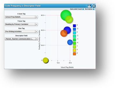
The biggest issue users have with this workspace stems from a lack of understanding about the basic controls that govern the visual representation of the data. Most often, since they are presented as icons and radio boxes (check boxes) people either do not notice them, or they ignore them.
Below we will discuss the icons and controls to look for (and double check) when creating charts, graphs, and plots in the Analyze Workspace to ensure that you are looking at the data you THINK you are looking at for each visualization in your text analysis. We also encourage new users to spend some time looking at the Analyze guide where you can learn about each graph available.
Know your icons The icons available to you for each chart will be at the top right hand corner of your workspace in the blue bar.
Pie Chart: Allows you to display data in a pie chart.
Bar Chart: Allows you to display data in a bar chart.
Toggle Active Data Filtering: If you are filtering your data, you can use this icon that looks like a funnel to toggle between your active set (that which is filtered) and the total data in your project. This icon will only appear when you have a filtered set active. You can filter your data set by using the Data Set Workspace, or by clicking on part of a given chart to show the excerpts behind the image and clicking on ‘Make Active Set.’ See more in our User Guide under ‘Data Filtering.’
Export: Exporting data is easy when conducting your text analysis in Dedoose. You can export the chart you are viewing on your screen by selecting this icon. You can export to PDF or Excel. There are also charts and graphs, such as the Descriptor Ratio Charts, that display more than one chart on the page. In this case, you can float your cursor over the chart you wish to export and click on the icon that looks like a piece of paper. See below.

Full Screen: This will allow you to see the chart full screen versus just in the chart section of Dedoose.
Defaults and control settings – what should I be looking for in my text analysis? It is important to know what controls are available for each graph so you can make sure you have activated the controls you wish to use. There are different default settings for each visualization in order to guide you to what we see as the most commonly used representation. But, each project is different and the defaults that work best for one project may not work for you. So, keep an eye out when working on your next text analysis!

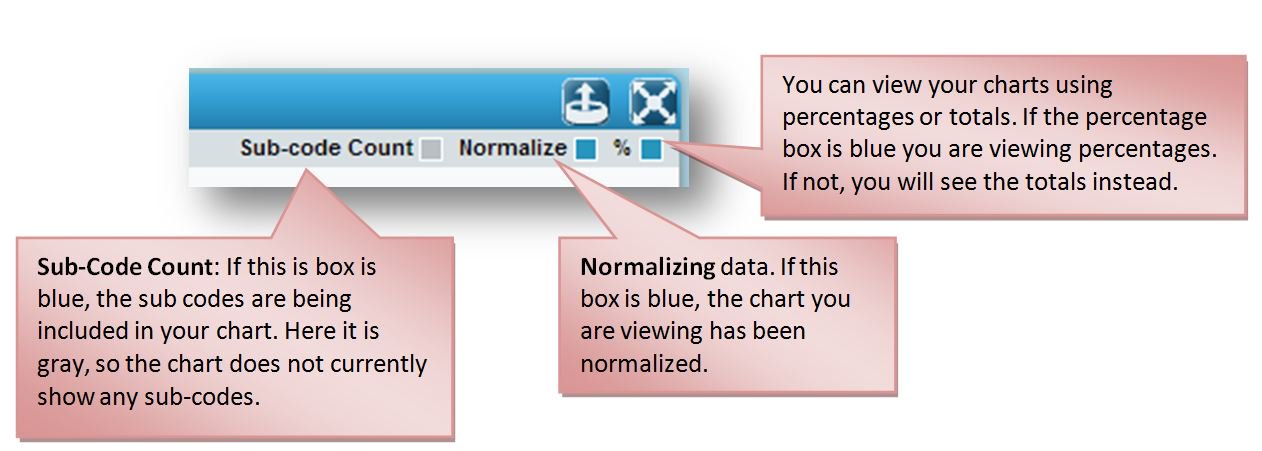
Important controls for these charts can be found in the panel sub-header below the icons showing blue or gray boxes (called radio buttons). These controls include ‘Sub-code Count,’ ‘Normalize,’ ‘%,’ and ‘0’s.’ If you click on the checkbox it will activate or deactivate each specific control. By default, the ‘Normalize’ and ‘%’ boxes are blue, indicating they are activated. When looking specifically at code based visualizations you can also choose to view code frequency or code weight in many charts, graphs, and plots.
These default settings are important to double check as they may change your data visualization dramatically. To make sure that these visualization options are clear we have created a short glossary below.
Normalization:

‘Normalization’ adjusts each bar based on the relative number of cases in each sub-group. A graph of your data focused on ‘frequency’ can be relatively meaningless if there are unequal numbers of individual cases across each sub-group. The sub-groups here are Hispanic and African American participants as shown in the bar graph above. Now, if there are far more Hispanic participants in your study, as was the case in this example study, all your data will appear as though a greater number of Hispanic participants are speaking about a particular theme…when in reality this is caused by having a larger population of Hispanic participants.
For example, the second, ‘non-normalized,’ chart , as compared to the original, appears to suggest an incredibly high frequency of ‘Reading by Primary Care Taker’ coded excerpts for the Hispanic group. This is of course expected to be the case here since we know we have a greater number of Hispanic participants, so this data is not helpful unless normalization is ON. Turning off the normalization adjustment results in a possibly misleading visualization. Simply put, normalized charts provide a more unbiased perspective of the underlying data and provides a more ‘meaningful’ picture that can help communicate what you are finding in your analysis.
Sub-Codes:

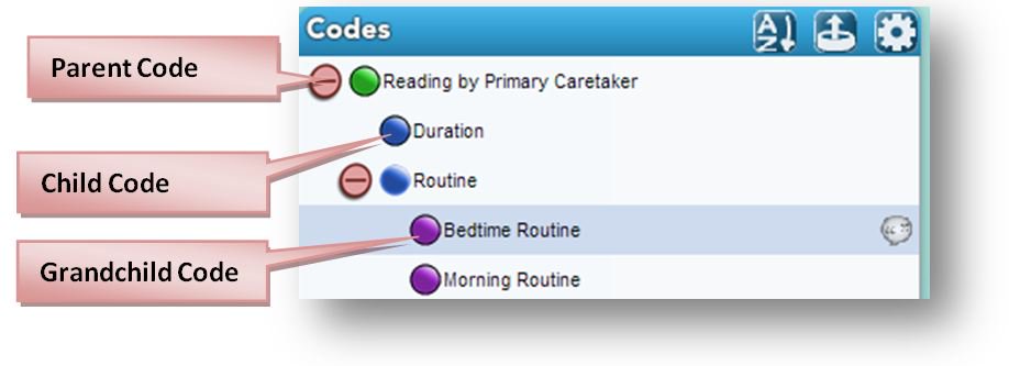
The Sub-code Count check box (which defaults to ‘off’) allows the inclusion of all code children, grandchildren etc. that are hierarchically attached ‘underneath’ another code. Codes that have a sub-code attached are called Parent (or Super-ordinate) Codes. Parent codes can have child codes, grandchild codes, and so on. They roll up the tree when included in charts as sub-codes. For example, since the ‘Reading by Primary Caretaker’ code has child and grandchild codes associated with it in the tree, all excerpts coded with ‘Reading by Primary Caretaker’ AND the child and grandchild codes would all be included in the chart for ‘Reading by Primary Caretaker.’
Percentage:
The ‘%’ check box converts the chart from a raw count presentation to a percentage basis presentation.
0’s:

In the Descriptor Field by Descriptor Field chart, if this box is blue then you are including subcategories in the display that have ‘zero counts.’
Frequency vs. weight when looking at codes:

When dealing with code charts, you have the option of switching the chart from frequency (relative excerpt count) to average weight applied. Applying a weight system to codes, for example, sentiment weighting, can add a deeper level and entirely unique mixed method dimension/perspective to your analysis.
Ready for more? As you get the hang of the Analysis Workspace take a look at the filtering sections of our user guide to learn how to take your text analysis to the next level. One of the most amazing things about the Analyze Workspace is that for each visual representation of your data you are able to look at the underlying data, export that data, or even filter by the data you are looking at. By using controls and filtering you can look at your data in new and exciting ways!