
Article: A Quick Summary of the Demo Project
Tags
- All
- Training (4)
- Account Management and Security (9)
- Features of Dedoose (9)
- Dedoose Desktop App (1)
- Dedoose Upgrades and Updates (5)
- Dedoose News (6)
- Qualitative Methods and Data (11)
- Other (5)
- Media (5)
- Filtering (5)
- Descriptors (10)
- Analysis (22)
- Data Preparation and Management (20)
- Quantitative Methods and Data (5)
- Mixed Methods (20)
- Inter Rater Reliability (3)
- Codes (26)
- Tags:
- Codes
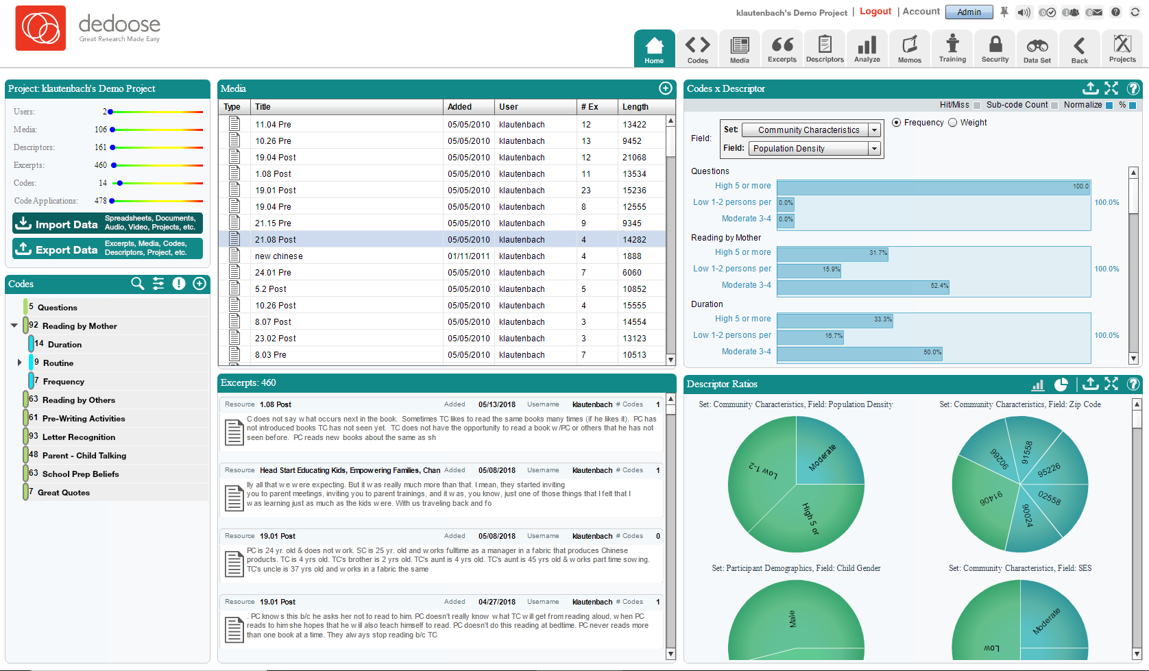
Hey there Dedoosers! In this article we’re going to go over the demo project. Included with every new account, the demo project gives you a fully populated example to look over and help you understand what Dedoose is and what it can do. By going over specific sections of the demo project, we hope to help get you off the ground and started on your own project. Please note, a lot of what we will be going over here is covered more thoroughly elsewhere, this is more of a quick summary of what a project looks like when completed and a few of the steps involved in getting started yourself. The first thing you’ll see is the home screen. Here we have our project details, how much media, users, excerpts and such. Below that we have our code tree. For those of us new to this kind of research the code tree is where most of the qualitative analysis comes from. We code documents for thematic elements and use the various charts and graphs to pick out trends and patterns. Then we’ve got our media list, below that we’ve got the excerpts of the media. On the right we have a couple graphs for a snapshot of what our project is about.
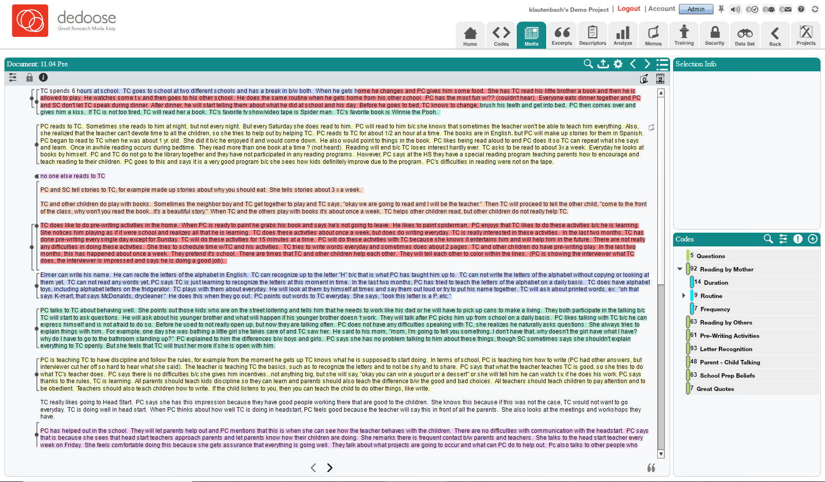
But that's just the beginning. Let’s take a look at a media file to see what kind of work we’re going to do. Clicking on a media file will take us to the document viewer. Here we’ve got our document taking up most of the space, and our selection information box and below that our code tree. You can see some highlighted text within the document, this is an excerpt that has already been coded. Clicking the bracket to the left will display the code and excerpt info in the selection box. This is where the bulk of the work will take place in regards to our qualitative data. Reviewing documents, or other media, and applying codes to portions of them to create excerpts.
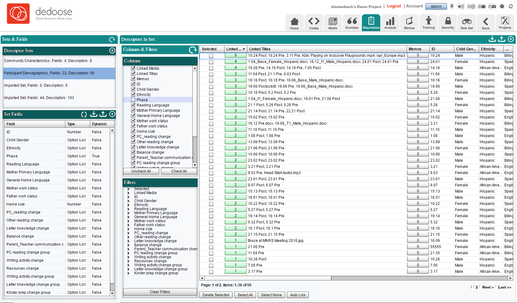
Next up let’s look at the descriptors tab. This can be somewhat overwhelming at first, but it’s essentially all of our quantitative data. We have a lot of options to sort and filter and we have our actual descriptors here in the grid. These represent our participants, and the data that goes with each individual. The left most side is the sets and set fields. Sets are like folders, set fields would be the questions that lead to the answers we have in our grid.
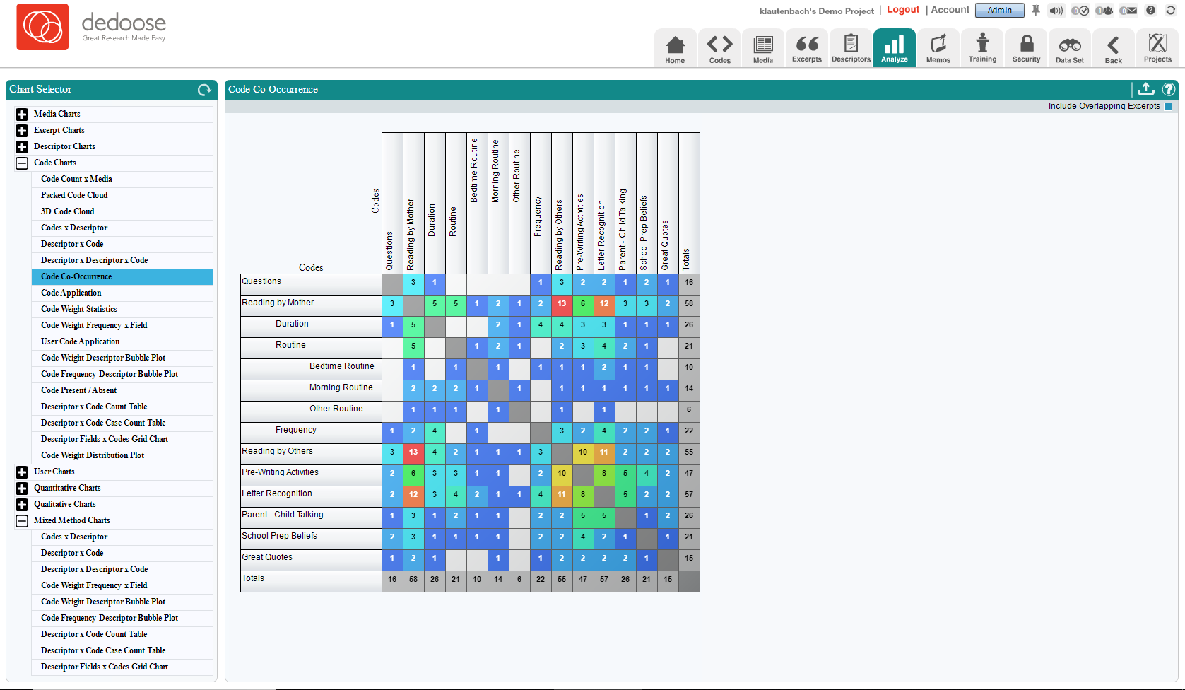
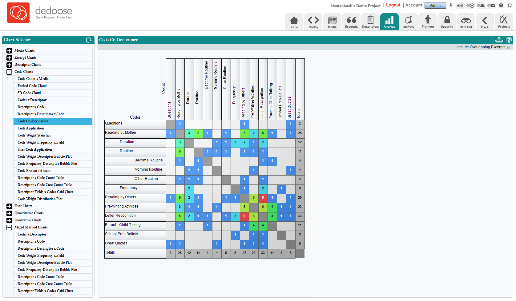
But what does all this data DO? Let’s move over to the analyze tab. For some quick glances at the product of this project let’s find the packed code cloud. This shows us by size the relative occurrence of codes throughout our project. The more applied a code has been, the larger the text of that code in the cloud. We also have some fun grids like the code co-occurrence chart. This gives us a display of how often codes are applied together in the same document. Turning off overlapping excerpts shows us how many time codes have co-occurred in the same excerpt. This is a great tool for picking our trends.
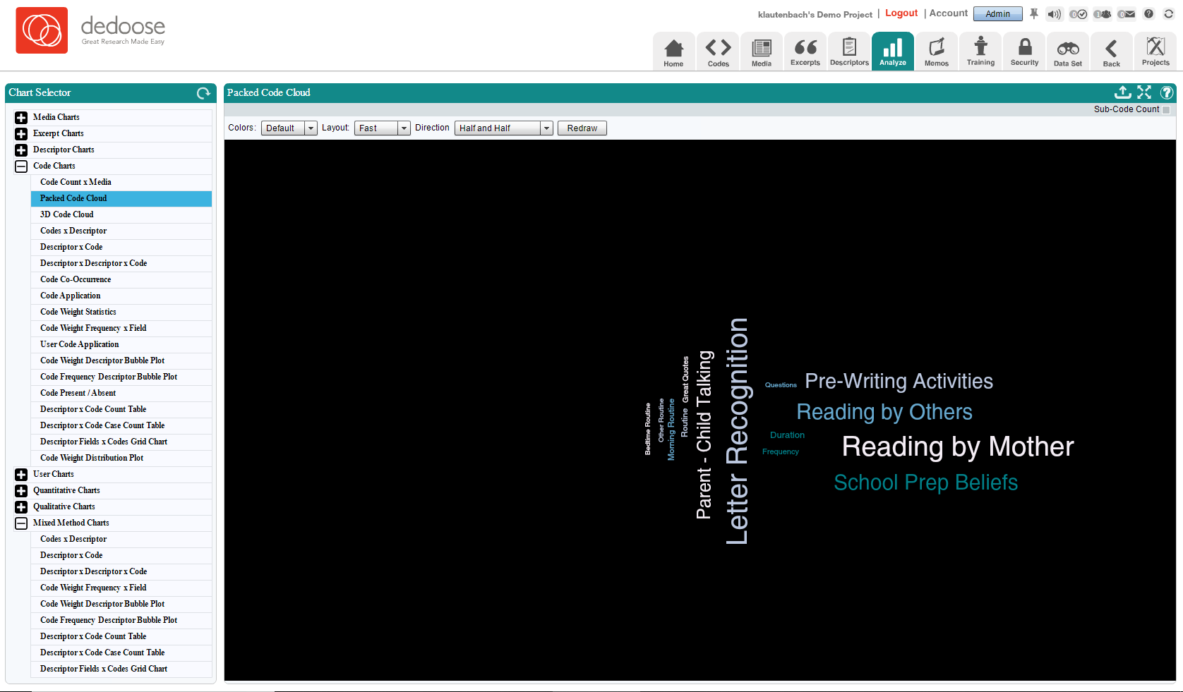
There are quite a few charts and graphs in here, we encourage you to explore a little and see how many different ways this data can be arranged and displayed.
Now this was just a quick overview of the demo project and some of the portions in Dedoose that help get the most out of your study. We always recommend new users attend one of our free webinars, any lingering questions or concerns can usually be addressed there and believe us when we say no one knows Dedoose better than Dr. Lieber. https://www.dedoose.com/resources/webinars
We also have our user guide to help you brush up on the various portions and functions of the application. https://www.dedoose.com/userguide
Lastly, we here at support are always happy to help with any questions you might have. We love to hear from our users, so if you have an idea, a suggestion or any other comment please let us know.