Article: Importing and Analyzing Twitter Data with Dedoose!
Tags
- All
- Training (4)
- Account Management and Security (9)
- Features of Dedoose (9)
- Dedoose Desktop App (1)
- Dedoose Upgrades and Updates (5)
- Dedoose News (6)
- Qualitative Methods and Data (11)
- Other (5)
- Media (5)
- Filtering (5)
- Descriptors (10)
- Analysis (22)
- Data Preparation and Management (20)
- Quantitative Methods and Data (5)
- Mixed Methods (20)
- Inter Rater Reliability (3)
- Codes (26)
8/7/2017
Dedoose is an amazing tool you can use for analyzing all types of data, and today we will import and do some basic analytics with Twitter data! Check out this step by step guide to import your twitter data!
First, download your twitter archive:
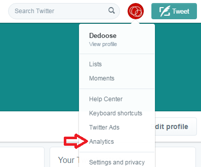
- Click the Profile button on the top right
- Click Analytics

- Click Tweets
- Select your range on the top right
- Click Export data
Twitter will only let you export 3 months at a time, but you can export these 3 month bundles separately and just join them together in Excel for analysis across a longer span of time! Now that we have those data in Excel we can jump right into Dedoose, however we suggest making a few changes to the file to before importing. First, let’s open that Excel file:

Rename your Tweet IDs. (Note: Our examples have dummy data filled in
-
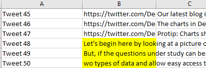
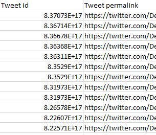
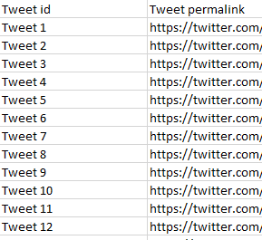
Tweet ID’s are long and can be hard remember, let’s fix that:
- Go to the “Tweet id” column in your Excel file
- Rename the first case to “Tweet 1”
- Click and hold the bottom right corner of that cell and...
- Drag it down the full column until you reach the bottom of your Excel data
- You will see it automatically apply step (2) to every row in the column creating a consecutive number identification for the rows
Your column will go from this:
-
This will make it easier for you to jump into Twitter and view a specific tweet
Delete the promoted content fields (Column W through Column AP) if you do not have any promoted Tweets
-
Unless you have promoted content and would like to analyze that as well, these columns should be deleted as they will contain no data
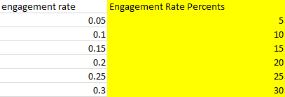
Convert the engagement rate column (Column G) to percentages
-
This step will make your engagement rates digestible, as having a list of un-rounded decimals can be hard to work with:
-
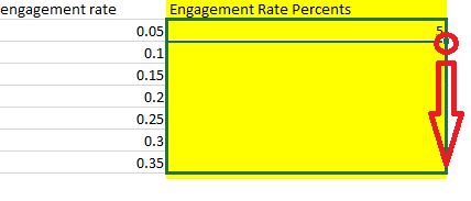
Insert a column next to Column G
- Title it “Engagement Rate Percents” or something akin to that

- Click in the first blank cell for your newly created column
- Type the following into it: =ROUNDDOWN(G2*100,1)
NOTE: This is assuming your original engagement rate column is still G, if not then replace G with the appropriate column

- Hit Enter

- You will see a rounded down percentage derived from the first cell in your engagement rate column
- Click on the cell that has the % value so it is highlighted green
- Click and hold the bottom right corner of the cell

- Drag it down the entire column until you reach the bottom of your Excel sheet
- You will see it automatically apply step (d) to the entire column

- Delete any other columns you do not want to include and save the file
Import it into Dedoose!
https://www.dedoose.com/userguide/gettingstarted/importingdata#ImportingData
Now let’s run some basic analysis on your Twitter data, but first click the Analyze tab!
Codes x Descriptor: Find what tweets performed the best.
- Click Descriptor Charts
- Click Codes x Descriptor
- In the Fields drop down menu, select Engagement Rate Percents
- You will now be able to see the distribution of codes across your percentages
- Which of your tweets got the highest engagement rate?
- Select another field, which of your tweets got the most retweets?
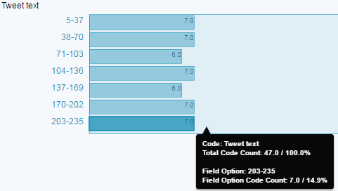
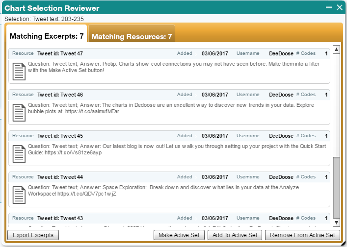
In our example below, 7 tweets got engagement rates percentages of 203% - 235% (Don’t worry these are dummy numbers we added)
- Click Descriptor Charts
- Click Descriptor x Descriptor x Code
- Select your fields of interest
- For example, how many retweets did you get as your engagement rate grew?
If you decide to code your data (For example fun vs sharing news or content, @someone vs not @someone, or whatever themes or patterns you can think of!) You will be able to see just how your tweets performed across any lines.Here are a few more charts you can take advantage of if you decide to code your tweets:

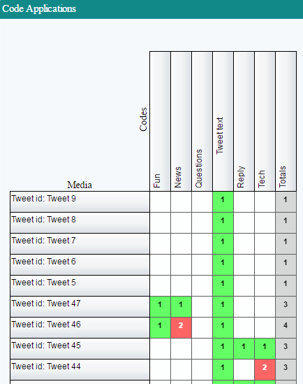
Code Application: Have a subset of your tweets you want to see patterns for? Find it here
- Click Code Charts
- Click Code Application
-
You will see a distribution of your codes per tweet
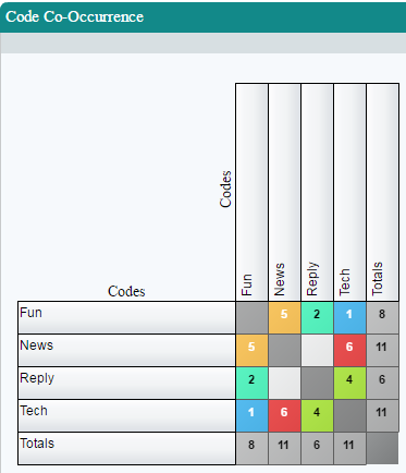
Code Co-Occurrence: Find what themes or codes appear most often together in your tweets.
-
Click Code Charts
- Click Code Co-Occurrence
- Warmer colors will indicate codes that most often appear together
Want more content like this? We are all ears, let us know!
